MUSHROOM HUNTER PACKAGING DESIGN
山野金刚包装设计
「山野金刚™」诞生于香格里拉原始森林的时令松茸品牌。
得益于国内生鲜物流系统的发展进化,山野金刚深林直采、当日配送,锁住“产地新鲜”味道的品牌理念得以实现。此次我们为其品牌打造配送外包装设计。相比常规包装,快递配送场景下的包装的设计要考虑更多不同的特殊场景。
过往,行业竞品考虑购买后运输的便携性,通常做法是盒体都配有牛奶扣的提手,将主视觉部分设置到了前面,这种设计更适合货架展示,而顶部(提手区)更大的区域没能被更有效利用。
山野金刚松茸产品当下主要是线上下单,顺丰配送到家,去掉了个人货架购买场景,所以我们将盒体的主视觉区域从前部,调整到了画幅更大的上面(顶部),把核心信息设置在顶部,把更大的空间用来更好的展示产品价值,而作为收货人开启的第一视角,也更具仪式感。

2、真品质,无需“画面仅供参考”
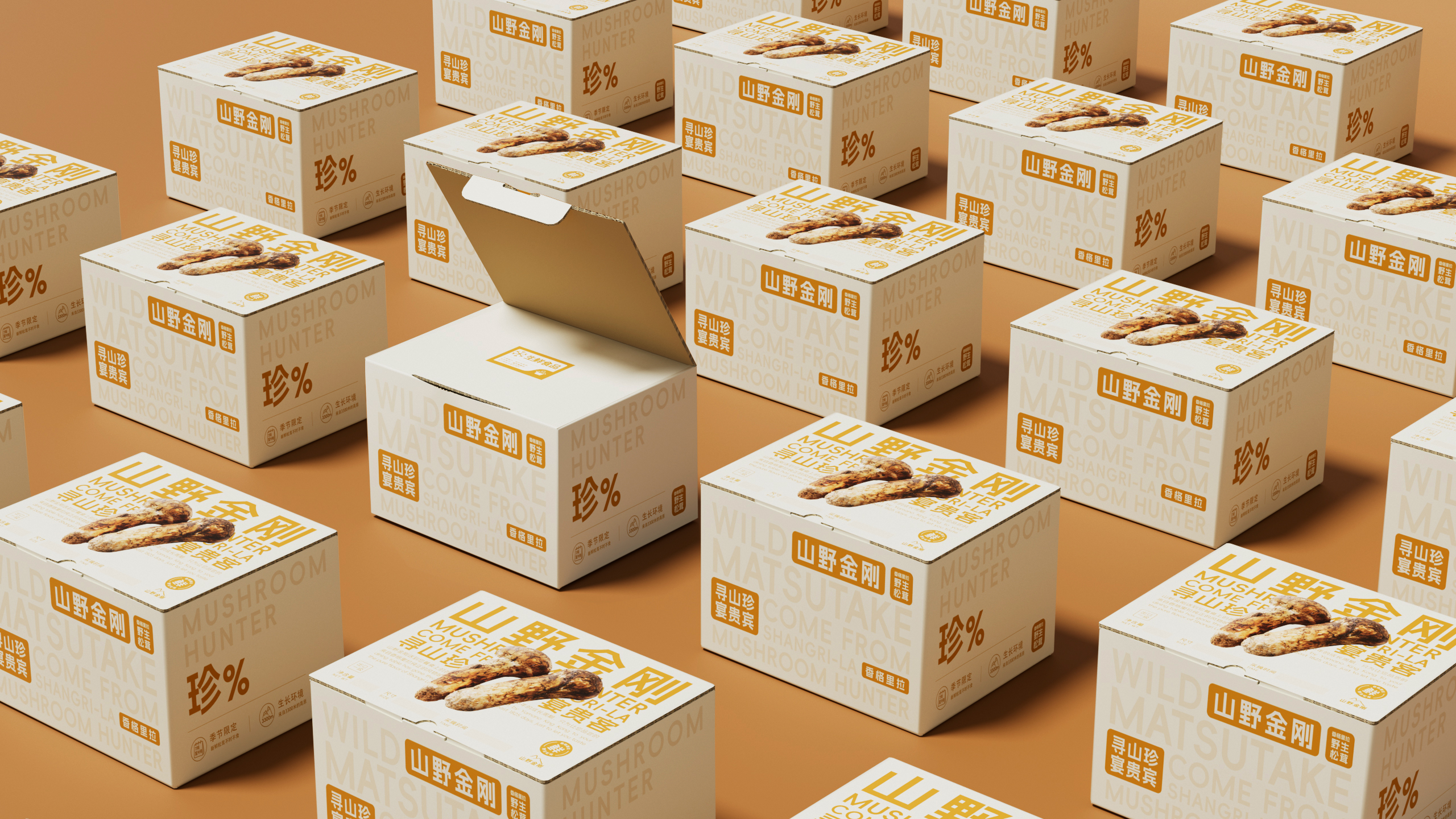
作为高端生鲜食材,包装画面上的产品我们1:1还原食材真实尺寸,不过度放大产品图用“画面仅供参考”来误导用户,因为好食材,真的只需“还原”即可。
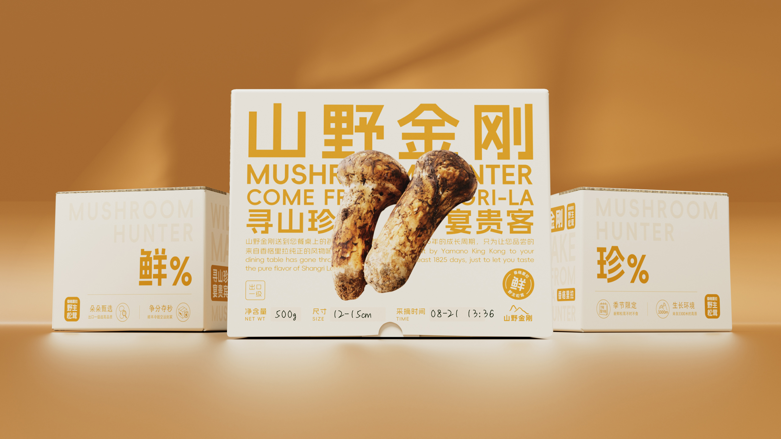
包装是品牌的第一个广告位,产品站C位,强化品类,品牌名站文字信息的C位,让品牌从发货的第一时间起可以持续在不同场景做免费的最大化曝光。
3、保鲜承诺,手写盒上,有诚意、添保障
山野金刚承诺当天深林直采,当天发货,24小时全程冷链直达。光说不信?
我们设计手写的采摘时间和规格区,采摘员当天采摘现场写,增加“信服力”和“新鲜的定制感”。
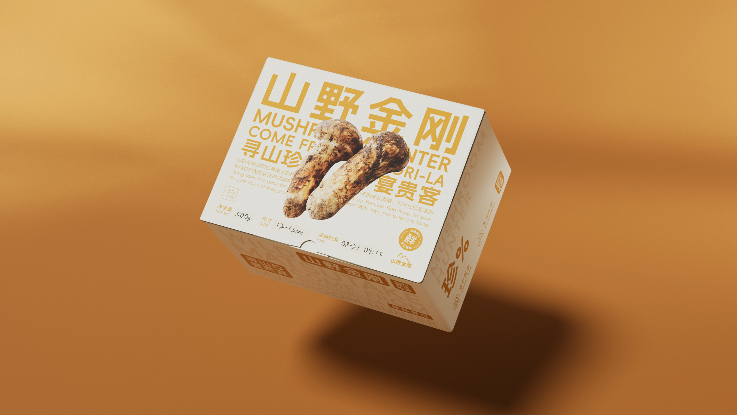
相比货架售卖的产品,线上售卖在发货和配送过程中,盒体的摆放和堆叠充满不确定,除了正面信息要考虑,还要考虑混杂在其他快递货品中信息是否能被有效的传达。所以我们在前、后、左、右的不同面,都做了核心信息的强化设计,即便被“倒着放”,我们依然能被快速识别,有效传播。

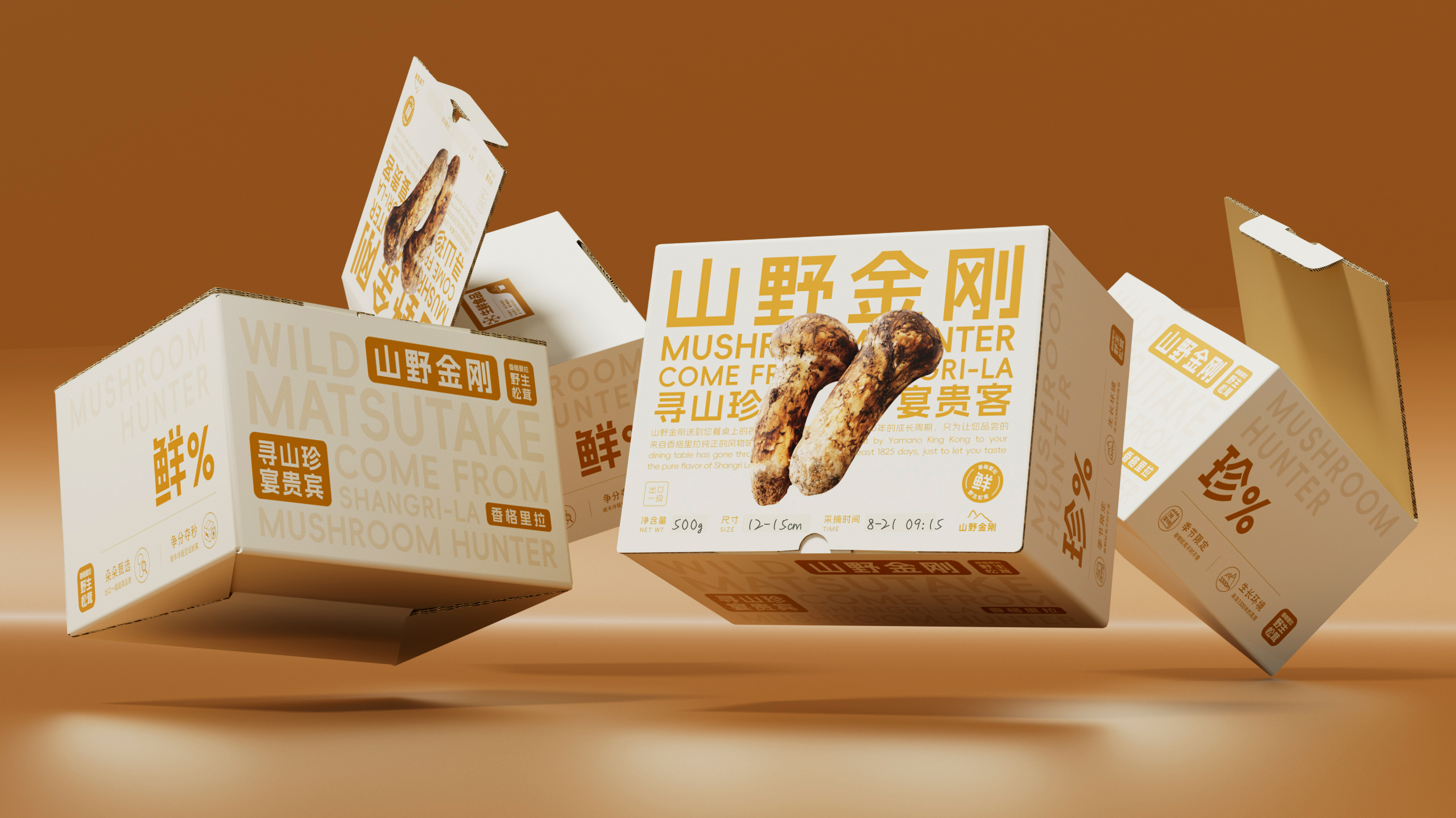
这是山野金刚作为诞生不久新品牌的第一代包装,随着高品质产品上市得到的极高口碑,第一批包装已快速用尽,后续我们正着手准备摆脱行业通用的包装盒+保温盒的标准做法,探索在配送、保护和拆启体验更好,传播效更优的包装设计方案。

—
ART DIRECTOR: Dabao
DESIGNER: Dabao/Qiurong
YEAR: 2023
CLIENT:MUSHROOM HUNTER
MUSHROOM HUNTER™ The seasonal matsutake brand was born in the primitive forest of Shangri La.
Thanks to the development and evolution of the domestic fresh logistics system, the brand concept of “fresh from the place of origin” has been realized through direct harvesting in the deep forest and daily delivery of MUSHROOM HUNTER.
We are creating a delivery packaging design for its brand this time. Compared to conventional packaging, the design of packaging in express delivery scenarios needs to consider more different special scenarios.
1. Ritual design
Similar brands consider the portability of transportation after purchase. The industry usually adopts a handle with milk buttons on the box body, and sets the main visual part to the front. This design is more suitable for shelf display, but the larger area at the top (handle area) is not effectively utilized.
MUSHROOM HUNTER’s matsutake products are mainly ordered online and delivered to home by SF Express, eliminating the personal shelf purchase scene. Therefore, we have adjusted the main visual area of the box from the front to the larger top of the picture (top), and set the core information at the top. The larger space can better showcase the product value, and as the first perspective of the consignee, it also has a more ceremonial sense.
2. True quality, no need for ‘images for reference only’
As a high-end fresh food ingredient, the product on the packaging screen is 1:1 restored to its true size. We do not exaggerate the product image and use “the image is for reference only” to mislead users, as good ingredients require restoration.
Packaging is the first advertising space for a brand, with a product station at position C and a strengthened category. The brand name occupies position C in the text message, allowing the brand to continuously maximize its exposure in different scenarios for free from the first time of shipment.
3. Preservation commitment, on the handwritten box, with sincerity and added guarantee
MUSHROOM HUNTER promises direct mining in the deep forest on the same day, shipment on the same day, and 24-hour full cold chain direct delivery. Are you just saying you’re not convinced?
We design a handwritten picking time and specification area, and write it on the spot on the same day to increase “credibility” and “fresh customization”.
4. Show product value in any scenario without blind spots
Compared to products sold on shelves, online sales are full of uncertainty in the placement and stacking of boxes during the shipping and delivery process. In addition to positive information, it is also important to consider whether the information mixed in other express goods can be effectively conveyed. So we have strengthened the design of core information on different sides of the front, back, left, and right, even if placed upside down, we can still be quickly identified and effectively disseminated.
This is the first generation packaging for MUSHROOM HUNTER, a newly born brand. With high reputation feedback from the product launch, the first batch of packaging has almost been used up. In the future, we are preparing to break away from the standard configuration of packaging boxes and insulation boxes commonly used in the industry, and explore packaging design solutions that provide better delivery, protection, and disassembly experiences and better dissemination efficiency.


